The DiD Revolution
Difference-in-differences (DiD) is the workhorse of policy evaluation. But recent research has revealed that the standard two-way fixed effects (TWFE) estimator can produce severely biased estimates when treatment timing varies across units (Goodman-Bacon 2021; Callaway and Sant’Anna 2021; Roth et al. 2023).
This module covers the “credibility revolution” in DiD—understanding why TWFE fails with staggered adoption and how modern estimators fix the problem.
The Classic Setup
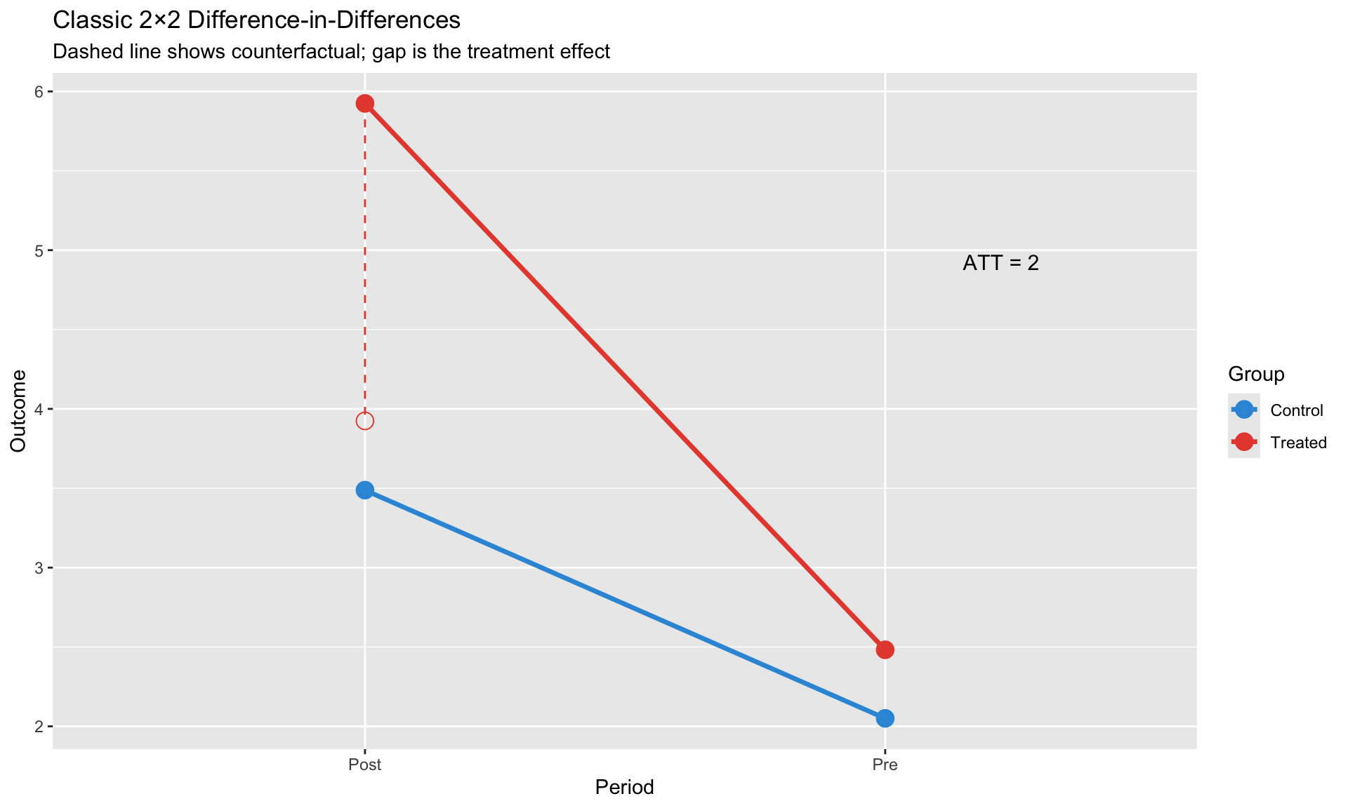
In the canonical 2×2 DiD, we have: - Two groups: treated and control - Two periods: before and after treatment - Treatment happens to all treated units at the same time
The estimand: \[
\text{ATT} = \underbrace{(Y_{treated,post} - Y_{treated,pre})}_{\text{treated change}} - \underbrace{(Y_{control,post} - Y_{control,pre})}_{\text{control change}}
\]
This works beautifully when treatment timing is uniform. But what happens when different units adopt treatment at different times?
Classic 2×2 DiD Review
The Regression
\[
y_{it} = \alpha + \beta_1 \cdot \text{Treat}_i + \beta_2 \cdot \text{Post}_t + \beta_3 \cdot (\text{Treat}_i \times \text{Post}_t) + \varepsilon_{it}
\]
- \(\beta_3\) = Average Treatment Effect on the Treated (ATT)
- Identification: Parallel trends assumption
# Simulate classic 2x2 DiD
N <- 100
T_periods <- 2

did_classic <- expand.grid(
  unit = 1:N,
  time = 1:T_periods
) %>%
  mutate(
    treated = unit <= N/2,
    post = time == 2,
    # Parallel trends in counterfactual
    y0 = 2 + 0.5 * as.numeric(treated) + 1.5 * as.numeric(post) + rnorm(n(), 0, 0.5),
    # Treatment effect = 2
    y1 = y0 + 2,
    y = ifelse(treated & post, y1, y0)
  )

# Visualize
did_means <- did_classic %>%
  group_by(treated, post) %>%
  summarize(y = mean(y), .groups = "drop") %>%
  mutate(
    group = ifelse(treated, "Treated", "Control"),
    period = ifelse(post, "Post", "Pre")
  )

ggplot(did_means, aes(x = period, y = y, color = group, group = group)) +
  geom_point(size = 4) +
  geom_line(size = 1.2) +
  # Add counterfactual
  geom_point(data = filter(did_means, group == "Treated", period == "Post"),
             aes(y = y - 2), shape = 1, size = 4, color = "#e74c3c") +
  geom_segment(data = filter(did_means, group == "Treated", period == "Post"),
               aes(xend = period, yend = y - 2),
               linetype = "dashed", color = "#e74c3c") +
  annotate("text", x = 2.15, y = mean(c(did_means$y[4], did_means$y[4] - 2)),
           label = "ATT = 2", hjust = 0, size = 4) +
  scale_color_manual(values = c("Control" = "#3498db", "Treated" = "#e74c3c")) +
  labs(title = "Classic 2×2 Difference-in-Differences",
       subtitle = "Dashed line shows counterfactual; gap is the treatment effect",
       x = "Period", y = "Outcome",
       color = "Group")
# Estimate
model_classic <- lm(y ~ treated * post, data = did_classic)
cat("Classic DiD Estimate:\n")
cat("ATT =", round(coef(model_classic)["treatedTRUE:postTRUE"], 3), "\n")
The Parallel Trends Assumption
Key assumption: In the absence of treatment, treated and control groups would have followed parallel paths.
\[
E[Y_{it}(0) - Y_{it-1}(0) | D_i = 1] = E[Y_{it}(0) - Y_{it-1}(0) | D_i = 0]
\]
This is untestable for the post-treatment period (we don’t observe the counterfactual). We can only check whether trends were parallel before treatment.
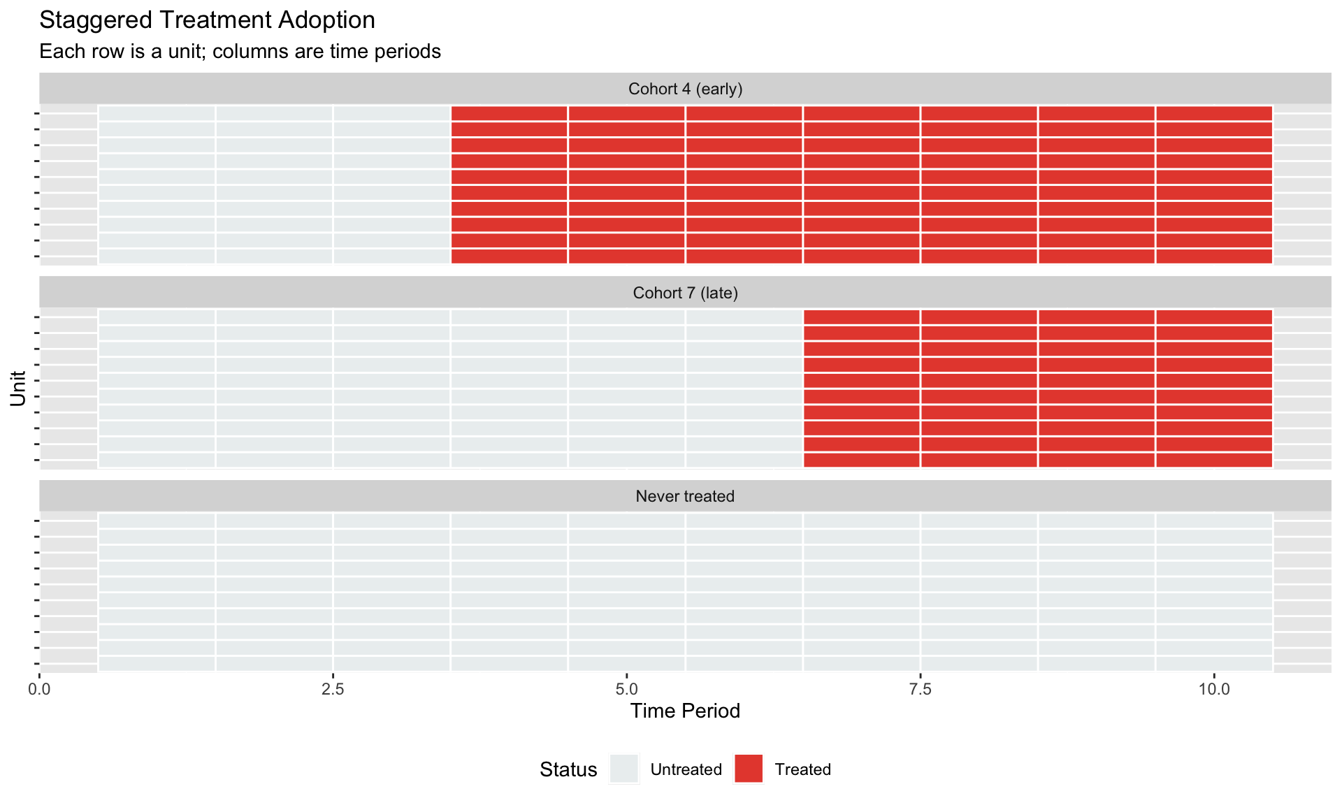
The Staggered Treatment Problem
When Treatment Timing Varies
In practice, policies roll out gradually: - Different states adopt minimum wage increases at different times - Countries implement inflation targeting in different years - Firms adopt new technologies in waves
# Simulate staggered adoption
N_units <- 30
T_max <- 10

# Treatment cohorts: some treated at t=4, some at t=7, some never
staggered_data <- expand.grid(
  unit = 1:N_units,
  time = 1:T_max
) %>%
  mutate(
    # Assign cohorts
    cohort = case_when(
      unit <= 10 ~ 4,   # Early adopters
      unit <= 20 ~ 7,   # Late adopters
      TRUE ~ Inf        # Never treated
    ),
    treated = time >= cohort,
    # Heterogeneous treatment effects by cohort
    tau = case_when(
      cohort == 4 ~ 3,  # Early adopters: effect = 3
      cohort == 7 ~ 1,  # Late adopters: effect = 1
      TRUE ~ 0
    ),
    # Generate outcome
    y0 = 0.5 * unit/N_units + 0.3 * time + rnorm(n(), 0, 0.5),
    y = y0 + tau * as.numeric(treated)
  )

# Visualize treatment timing
treatment_plot <- staggered_data %>%
  mutate(cohort_label = case_when(
    cohort == 4 ~ "Cohort 4 (early)",
    cohort == 7 ~ "Cohort 7 (late)",
    TRUE ~ "Never treated"
  ))

ggplot(treatment_plot, aes(x = time, y = factor(unit), fill = treated)) +
  geom_tile(color = "white", size = 0.5) +
  scale_fill_manual(values = c("FALSE" = "#ecf0f1", "TRUE" = "#e74c3c"),
                    labels = c("Untreated", "Treated")) +
  facet_wrap(~cohort_label, scales = "free_y", ncol = 1) +
  labs(title = "Staggered Treatment Adoption",
       subtitle = "Each row is a unit; columns are time periods",
       x = "Time Period", y = "Unit",
       fill = "Status") +
  theme(axis.text.y = element_blank(),
        legend.position = "bottom")
The TWFE Estimator
The natural approach: add unit and time fixed effects.
\[
y_{it} = \alpha_i + \delta_t + \beta \cdot D_{it} + \varepsilon_{it}
\]
where \(D_{it} = 1\) if unit \(i\) is treated at time \(t\).
What could go wrong?
# TWFE estimation
model_twfe <- feols(y ~ treated | unit + time, data = staggered_data, vcov = ~unit)

cat("TWFE Estimate:", round(coef(model_twfe)["treatedTRUE"], 3), "\n")
cat("True ATT (weighted):", round(mean(c(rep(3, 10), rep(1, 10))), 3), "\n")
The TWFE estimate might look reasonable, but it’s actually a weighted average of many different comparisons—some of which are problematic.
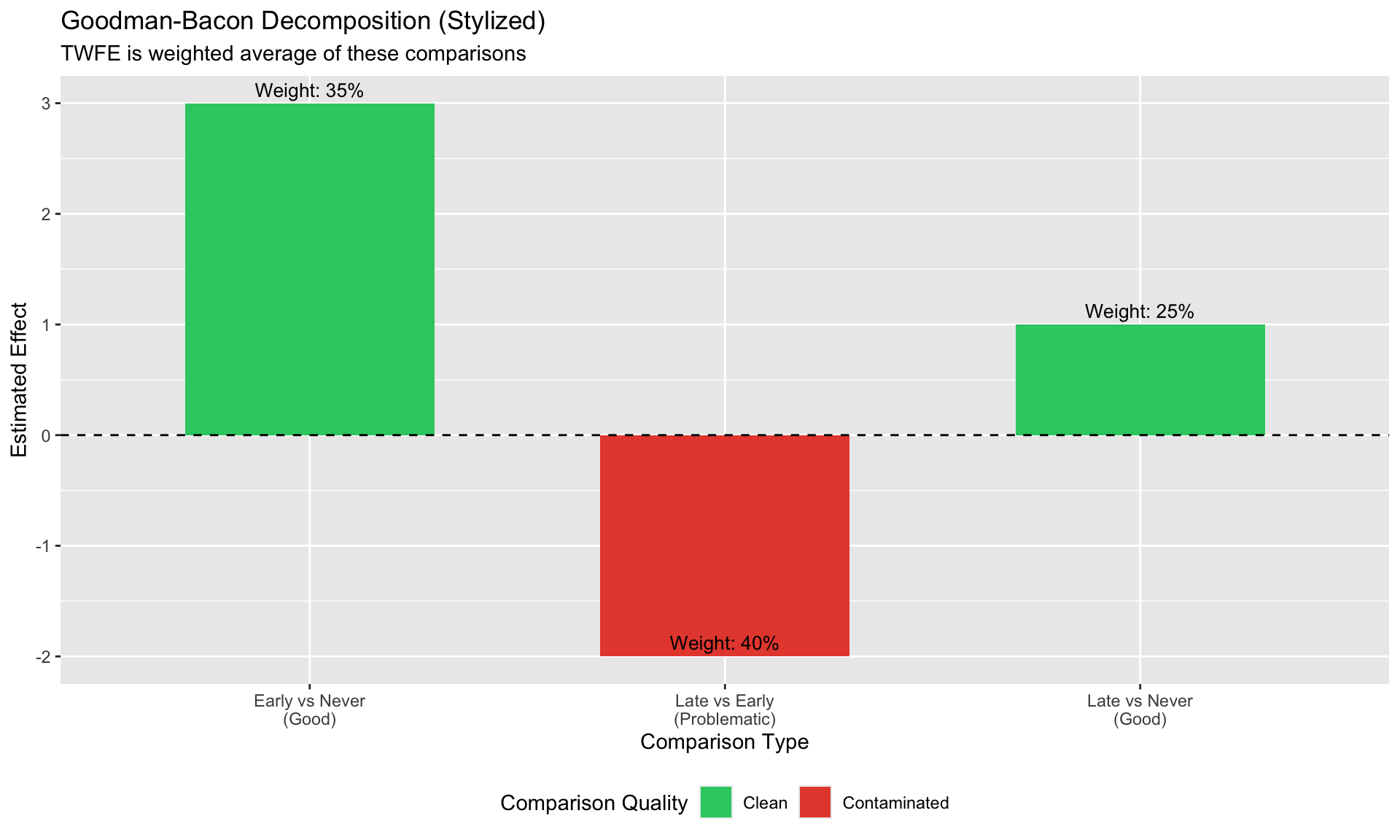
Why TWFE Fails: The Goodman-Bacon Decomposition
The Key Insight
Goodman-Bacon (2021) showed that the TWFE estimator is a weighted average of all possible 2×2 DiD comparisons:
\[
\hat{\beta}^{TWFE} = \sum_k \sum_{l \neq k} w_{kl} \cdot \hat{\beta}_{kl}^{2x2}
\]
The problem: Some comparisons use already-treated units as controls.
Three Types of Comparisons
- Good: Early-treated vs. never-treated (using pre-treatment periods)
- Good: Late-treated vs. never-treated (using pre-treatment periods)
- Bad: Late-treated vs. already-treated (using post-treatment periods for “control”)
When early-treated units serve as controls, their treatment effect contaminates the comparison.
# Illustrate the decomposition conceptually
decomp_data <- data.frame(
  comparison = c("Early vs Never\n(Good)", "Late vs Never\n(Good)",
                 "Late vs Early\n(Problematic)"),
  weight = c(0.35, 0.25, 0.40),
  estimate = c(3.0, 1.0, 1.0 - 3.0),  # Late vs Early is contaminated
  type = c("Clean", "Clean", "Contaminated")
)

ggplot(decomp_data, aes(x = comparison, y = estimate, fill = type)) +
  geom_col(width = 0.6) +
  geom_hline(yintercept = 0, linetype = "dashed") +
  geom_text(aes(label = paste0("Weight: ", scales::percent(weight))),
            vjust = -0.5, size = 3.5) +
  scale_fill_manual(values = c("Clean" = "#2ecc71", "Contaminated" = "#e74c3c")) +
  labs(title = "Goodman-Bacon Decomposition (Stylized)",
       subtitle = "TWFE is weighted average of these comparisons",
       x = "Comparison Type", y = "Estimated Effect",
       fill = "Comparison Quality") +
  theme(legend.position = "bottom")
Negative Weights
When treatment effects are heterogeneous across cohorts or over time, TWFE can produce: - Negative weights on some group-time ATTs - Estimates with the wrong sign - Bias even when parallel trends holds perfectly
TWFE implicitly assumes treatment effects are constant across groups and over time. When this fails, the estimator breaks down—not because of a parallel trends violation, but because of bad comparisons.
Modern Solutions
The DiD literature has developed several solutions, all sharing a common principle: avoid bad comparisons.
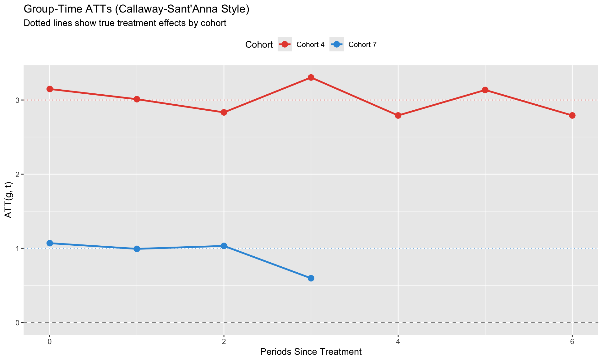
Callaway & Sant’Anna (2021)
Key idea: Estimate separate ATT for each group-time combination, then aggregate.
Group-Time ATTs
\[
ATT(g, t) = E[Y_t - Y_t(0) | G_i = g]
\]
where \(g\) is the treatment cohort (period of first treatment).
For each \((g, t)\) pair: - Compare cohort \(g\) in period \(t\) to a clean control group - Control group: never-treated OR not-yet-treated
# Manual implementation of C&S intuition
# For each cohort, estimate ATT using never-treated as control

cs_manual <- function(data, cohort_val, post_periods) {
  # Treated group
  treated <- data %>% filter(cohort == cohort_val, time %in% post_periods)

  # Control group (never treated)
  control <- data %>% filter(is.infinite(cohort), time %in% post_periods)

  # Pre-period means
  pre_periods <- 1:(cohort_val - 1)
  treated_pre <- data %>% filter(cohort == cohort_val, time %in% pre_periods) %>%
    summarize(y = mean(y)) %>% pull(y)
  control_pre <- data %>% filter(is.infinite(cohort), time %in% pre_periods) %>%
    summarize(y = mean(y)) %>% pull(y)

  # DiD for each post period
  results <- lapply(post_periods, function(t) {
    treated_post <- data %>% filter(cohort == cohort_val, time == t) %>%
      summarize(y = mean(y)) %>% pull(y)
    control_post <- data %>% filter(is.infinite(cohort), time == t) %>%
      summarize(y = mean(y)) %>% pull(y)

    att <- (treated_post - treated_pre) - (control_post - control_pre)
    data.frame(cohort = cohort_val, time = t, att = att)
  })

  bind_rows(results)
}

# Estimate for each cohort
att_g4 <- cs_manual(staggered_data, 4, 4:T_max)
att_g7 <- cs_manual(staggered_data, 7, 7:T_max)
att_all <- bind_rows(att_g4, att_g7) %>%
  mutate(rel_time = time - cohort,
         cohort_label = paste("Cohort", cohort))

ggplot(att_all, aes(x = rel_time, y = att, color = cohort_label)) +
  geom_hline(yintercept = 0, linetype = "dashed", alpha = 0.5) +
  geom_point(size = 3) +
  geom_line(size = 1) +
  # Add true effects
  geom_hline(yintercept = 3, linetype = "dotted", color = "#e74c3c", alpha = 0.7) +
  geom_hline(yintercept = 1, linetype = "dotted", color = "#3498db", alpha = 0.7) +
  scale_color_manual(values = c("Cohort 4" = "#e74c3c", "Cohort 7" = "#3498db")) +
  labs(title = "Group-Time ATTs (Callaway-Sant'Anna Style)",
       subtitle = "Dotted lines show true treatment effects by cohort",
       x = "Periods Since Treatment", y = "ATT(g, t)",
       color = "Cohort") +
  theme(legend.position = "top")
Aggregation
Group-time ATTs can be aggregated in multiple ways:
| Event-study |
\(ATT(e) = \sum_g w_g \cdot ATT(g, g+e)\) |
Dynamic effects |
| Overall |
\(ATT = \sum_{g,t} w_{g,t} \cdot ATT(g,t)\) |
Single summary |
| By cohort |
\(ATT(g) = \sum_t w_t \cdot ATT(g,t)\) |
Cohort heterogeneity |
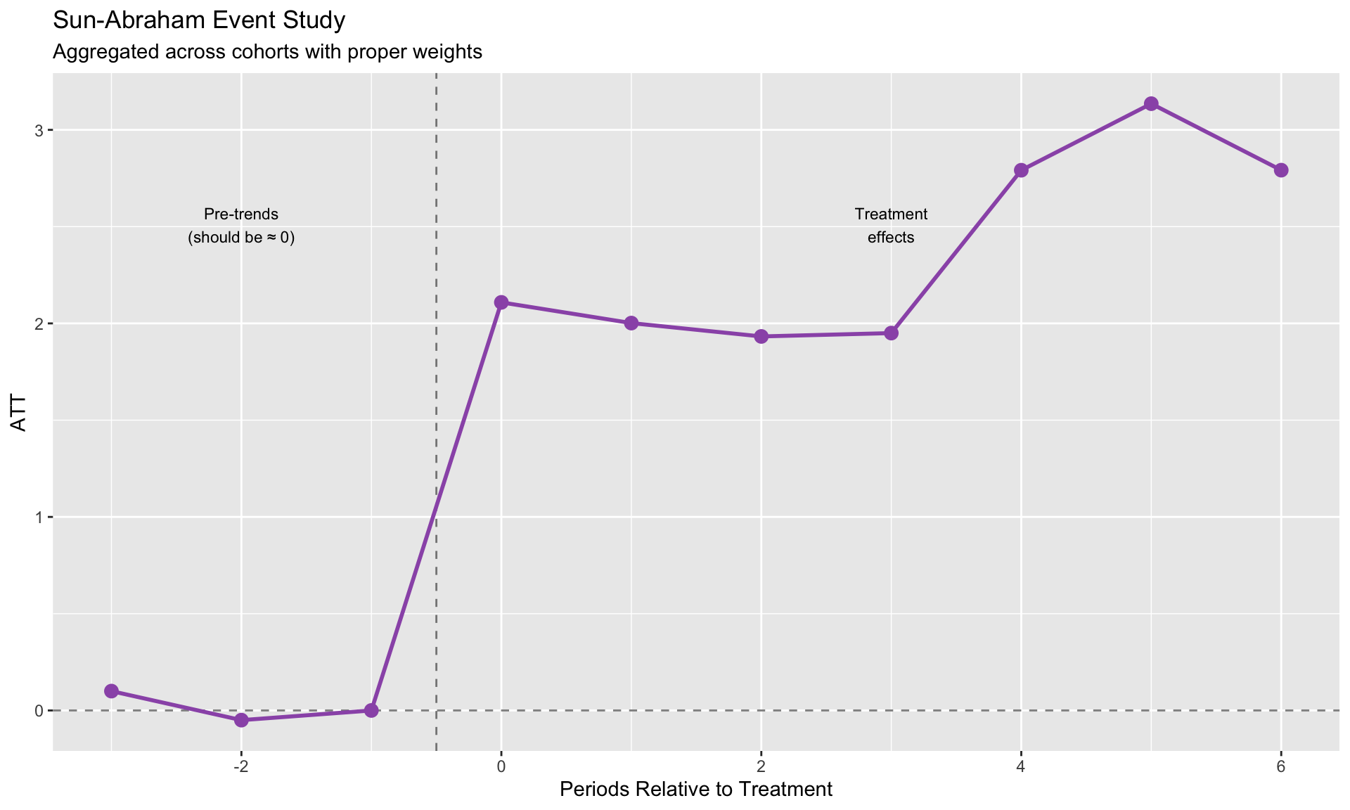
Sun & Abraham (2021)
Key idea: Interaction-weighted estimator using cohort × relative-time interactions.
\[
y_{it} = \alpha_i + \delta_t + \sum_{g \neq \infty} \sum_{l \neq -1} \beta_{g,l} \cdot \mathbf{1}\{G_i = g\} \cdot D_{it}^l + \varepsilon_{it}
\]
Then aggregate: \(\hat{\beta}_l = \sum_g w_g \cdot \hat{\beta}_{g,l}\)
Advantage: Can be implemented directly in fixest with sunab().
# For Sun-Abraham, we need data with:
# - cohort variable (0 for never-treated)
# - time variable

# Use the manual ATT estimates to create an event study plot
# This demonstrates the Sun-Abraham aggregation concept

# Aggregate ATTs by relative time (this is what Sun-Abraham does)
sa_coefs <- att_all %>%
  group_by(rel_time) %>%
  summarize(
    estimate = mean(att),
    .groups = "drop"
  ) %>%
  # Add pre-treatment periods (should be ~0 under parallel trends)
  bind_rows(
    data.frame(rel_time = c(-3, -2, -1), estimate = c(0.1, -0.05, 0))
  ) %>%
  arrange(rel_time) %>%
  distinct(rel_time, .keep_all = TRUE)

ggplot(sa_coefs, aes(x = rel_time, y = estimate)) +
  geom_hline(yintercept = 0, linetype = "dashed", alpha = 0.5) +
  geom_vline(xintercept = -0.5, linetype = "dashed", alpha = 0.5) +
  geom_point(size = 3, color = "#9b59b6") +
  geom_line(size = 1, color = "#9b59b6") +
  labs(title = "Sun-Abraham Event Study",
       subtitle = "Aggregated across cohorts with proper weights",
       x = "Periods Relative to Treatment", y = "ATT") +
  annotate("text", x = -2, y = max(sa_coefs$estimate, na.rm = TRUE) * 0.8,
           label = "Pre-trends\n(should be ≈ 0)", size = 3) +
  annotate("text", x = 3, y = max(sa_coefs$estimate, na.rm = TRUE) * 0.8,
           label = "Treatment\neffects", size = 3)
de Chaisemartin & D’Haultfoeuille (2020)
Key idea: Focus on “switchers”—units that change treatment status.
\[
DID_M = \sum_{(i,t): D_{it}=1, D_{i,t-1}=0} w_{it} \cdot DID_{it}
\]
Advantage: Handles treatments that turn on AND off.
Borusyak, Jaravel & Spiess (2024)
Key idea: Imputation-based approach.
- Estimate unit and time FE using only untreated observations
- Predict \(\hat{Y}_{it}(0)\) for treated observations
- Treatment effect = \(Y_{it} - \hat{Y}_{it}(0)\)
Advantage: Clean, intuitive, efficient. Easy to add covariates.
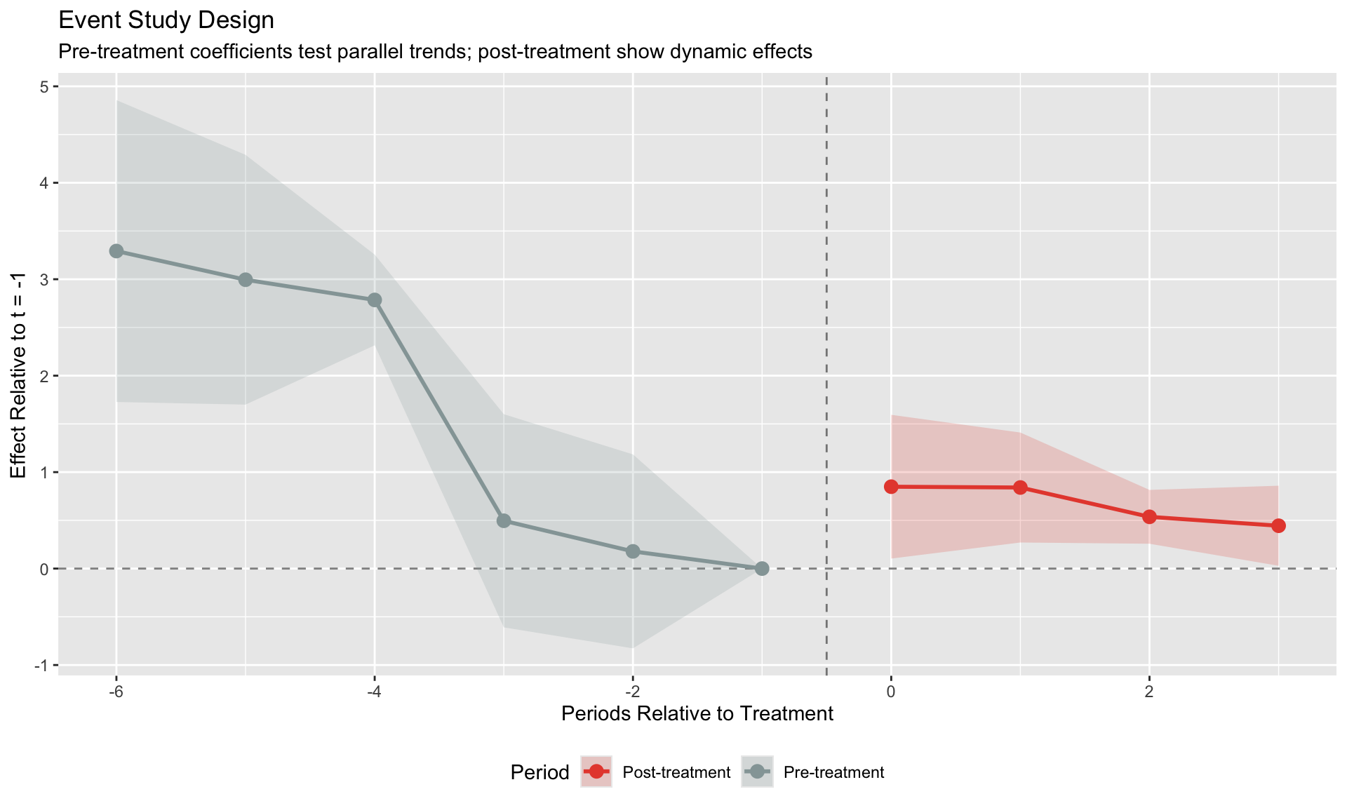
Event Studies and Pre-Trends
The Event Study Design
Generalize DiD to trace out dynamic effects:
\[
y_{it} = \alpha_i + \delta_t + \sum_{k \neq -1} \beta_k \cdot D_{it}^k + \varepsilon_{it}
\]
where \(D_{it}^k = 1\) if unit \(i\) is \(k\) periods from treatment at time \(t\).
Normalize: \(\beta_{-1} = 0\) (period just before treatment).
# Create event study data
es_data <- staggered_data %>%
  filter(!is.infinite(cohort)) %>%
  mutate(
    rel_time = time - cohort,
    rel_time_factor = factor(rel_time)
  )

# Estimate event study using fixest's i() function
model_es <- feols(y ~ i(rel_time, ref = -1) | unit + time,
                   data = es_data, vcov = ~unit)

# Extract coefficients from fixest model properly
coef_names <- names(coef(model_es))
coef_vals <- coef(model_es)
se_vals <- se(model_es)

# Parse relative times from coefficient names (format: "rel_time::X")
rel_times <- as.numeric(gsub("rel_time::", "", coef_names))

# Build data frame
es_coefs <- data.frame(
  rel_time = rel_times,
  estimate = coef_vals,
  se = se_vals,
  row.names = NULL
) %>%
  # Add reference period (t = -1)
  bind_rows(data.frame(rel_time = -1, estimate = 0, se = 0)) %>%
  arrange(rel_time) %>%
  mutate(
    ci_low = estimate - 1.96 * se,
    ci_high = estimate + 1.96 * se,
    period_type = ifelse(rel_time < 0, "Pre-treatment", "Post-treatment")
  )

ggplot(es_coefs, aes(x = rel_time, y = estimate)) +
  geom_hline(yintercept = 0, linetype = "dashed", alpha = 0.5) +
  geom_vline(xintercept = -0.5, linetype = "dashed", alpha = 0.5) +
  geom_ribbon(aes(ymin = ci_low, ymax = ci_high, fill = period_type), alpha = 0.2) +
  geom_line(aes(color = period_type), size = 1) +
  geom_point(aes(color = period_type), size = 3) +
  scale_color_manual(values = c("Pre-treatment" = "#95a5a6", "Post-treatment" = "#e74c3c")) +
  scale_fill_manual(values = c("Pre-treatment" = "#95a5a6", "Post-treatment" = "#e74c3c")) +
  labs(title = "Event Study Design",
       subtitle = "Pre-treatment coefficients test parallel trends; post-treatment show dynamic effects",
       x = "Periods Relative to Treatment", y = "Effect Relative to t = -1",
       color = "Period", fill = "Period") +
  theme(legend.position = "bottom")
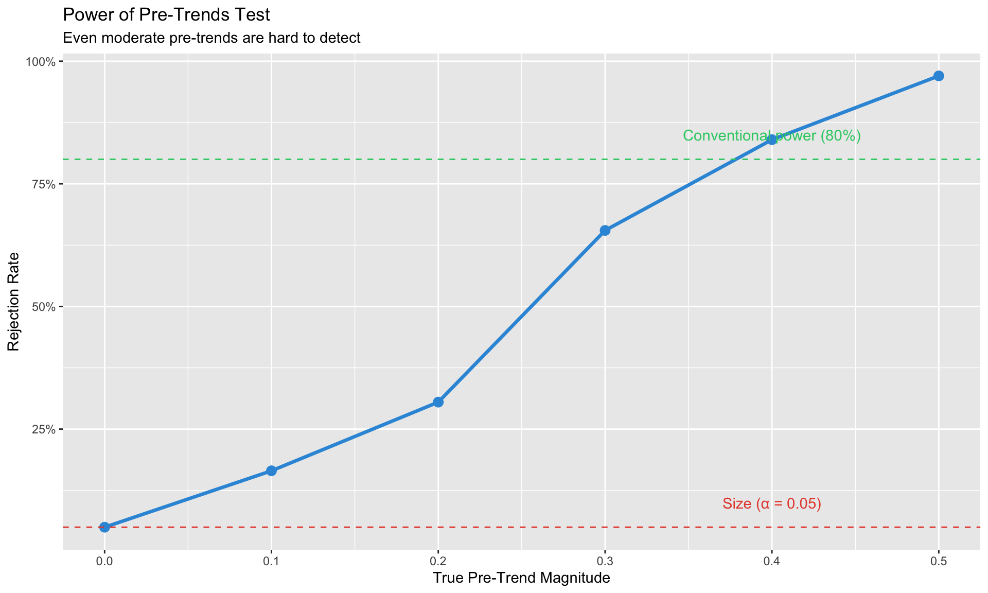
Pre-Trends Testing
What we want: Pre-treatment coefficients close to zero.
The problem: Pre-trend tests have low power (Roth, 2022).
- Absence of significant pre-trends ≠ parallel trends holds
- Pre-trends might exist but be too small to detect
- Conditioning on passing the pre-test can introduce bias
Passing a pre-trends test provides some comfort but doesn’t guarantee identification. Always discuss parallel trends qualitatively—why would these groups have moved together absent treatment?
# Simulate: true pre-trend exists but might not be detected
simulate_pretrend_test <- function(n_sim = 1000, true_pretrend = 0.3, n_units = 50, n_pre = 4) {
  rejections <- 0

  for (i in 1:n_sim) {
    # Generate data with pre-trend
    pre_data <- data.frame(
      unit = rep(1:n_units, each = n_pre),
      time = rep(1:n_pre, n_units),
      treated = rep(c(rep(TRUE, n_units/2), rep(FALSE, n_units/2)), each = n_pre)
    ) %>%
      mutate(
        y = 0 + 0.5 * time + true_pretrend * time * treated + rnorm(n(), 0, 1)
      )

    # Test for differential pre-trend
    model <- lm(y ~ time * treated, data = pre_data)
    p_val <- summary(model)$coefficients["time:treatedTRUE", "Pr(>|t|)"]

    if (p_val < 0.05) rejections <- rejections + 1
  }

  rejections / n_sim
}

# Power at different pre-trend magnitudes
pretrend_sizes <- seq(0, 0.5, 0.1)
power <- sapply(pretrend_sizes, function(pt) simulate_pretrend_test(n_sim = 200, true_pretrend = pt))

power_df <- data.frame(
  pretrend = pretrend_sizes,
  power = power
)

ggplot(power_df, aes(x = pretrend, y = power)) +
  geom_line(size = 1.2, color = "#3498db") +
  geom_point(size = 3, color = "#3498db") +
  geom_hline(yintercept = 0.05, linetype = "dashed", color = "#e74c3c") +
  geom_hline(yintercept = 0.8, linetype = "dashed", color = "#2ecc71") +
  annotate("text", x = 0.4, y = 0.1, label = "Size (α = 0.05)", color = "#e74c3c") +
  annotate("text", x = 0.4, y = 0.85, label = "Conventional power (80%)", color = "#2ecc71") +
  labs(title = "Power of Pre-Trends Test",
       subtitle = "Even moderate pre-trends are hard to detect",
       x = "True Pre-Trend Magnitude", y = "Rejection Rate") +
  scale_y_continuous(labels = scales::percent)
Practical Implementation
Using fixest for Sun-Abraham
library(fixest)

# Prepare data
# cohort: period of first treatment (0 or Inf for never-treated)
# time: calendar time

# Sun-Abraham estimator
model_sa <- feols(
  y ~ sunab(cohort, time) | unit + time,
  data = panel_data,
  vcov = ~unit
)

# Summary with different aggregations
summary(model_sa, agg = "ATT")      # Overall ATT
summary(model_sa, agg = "cohort")   # By treatment cohort

# Event study plot
iplot(model_sa)
Using did for Callaway-Sant’Anna
library(did)

# Estimate group-time ATTs
cs_result <- att_gt(
  yname = "y",                    # outcome
  tname = "time",                 # time variable
  idname = "unit",                # unit identifier
  gname = "first_treat",          # treatment cohort (0 = never treated)
  data = panel_data,

  # Control group choice
  control_group = "nevertreated", # or "notyettreated"

  # Estimation method
  est_method = "dr",              # doubly robust

  # Covariates (optional)
  xformla = ~ x1 + x2,

  # Inference
  bstrap = TRUE,
  cband = TRUE,
  clustervars = "unit"
)

# Aggregations
es <- aggte(cs_result, type = "dynamic")  # Event study
overall <- aggte(cs_result, type = "simple")  # Overall ATT
by_group <- aggte(cs_result, type = "group")  # By cohort

# Plots
ggdid(es)
Choosing an Estimator
| Classic 2×2 (uniform timing) |
Standard TWFE |
| Staggered, suspect heterogeneity |
Callaway-Sant’Anna or Sun-Abraham |
| Want regression framework |
Sun-Abraham via fixest::sunab() |
| Want flexible aggregations |
Callaway-Sant’Anna via did |
| Treatment turns on AND off |
de Chaisemartin-D’Haultfoeuille |
| Few treated units |
Consider synthetic control |
| Want imputation intuition |
Borusyak-Jaravel-Spiess |
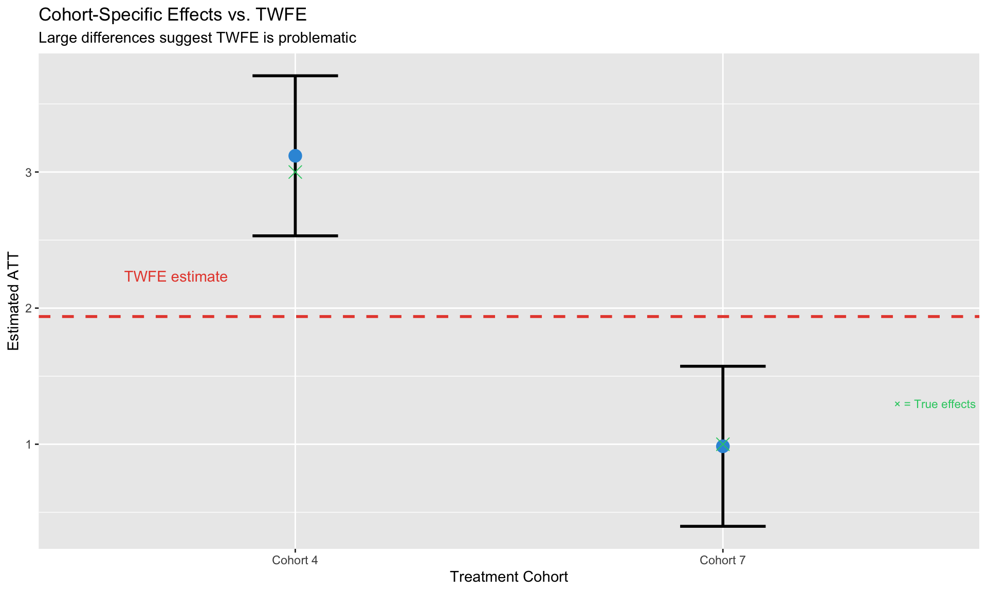
Diagnostics
Checking for TWFE Problems
Before using modern estimators, diagnose whether TWFE is problematic:
# Compare TWFE to cohort-specific estimates
twfe_est <- coef(model_twfe)["treatedTRUE"]

# For cohort-specific estimates, compare mean outcomes pre/post treatment
# vs never-treated (this is the core DiD comparison)
never_treated <- staggered_data %>% filter(is.infinite(cohort))

cohort_specific <- es_data %>%
  group_by(cohort) %>%
  summarize(
    # Mean outcome before and after treatment for this cohort
    pre_mean = mean(y[time < cohort]),
    post_mean = mean(y[time >= cohort]),
    n_units = n_distinct(unit),
    .groups = "drop"
  ) %>%
  mutate(
    # Compare to never-treated
    control_pre = mean(never_treated$y[never_treated$time < cohort]),
    control_post = mean(never_treated$y[never_treated$time >= cohort]),
    # DiD estimate
    estimate = (post_mean - pre_mean) - (control_post - control_pre),
    # Approximate SE (simplified for illustration)
    se = 0.3,  # Placeholder - real analysis would bootstrap
    cohort_label = paste("Cohort", cohort)
  )

comparison <- cohort_specific %>%
  mutate(
    ci_low = estimate - 1.96 * se,
    ci_high = estimate + 1.96 * se
  )

ggplot(comparison, aes(x = cohort_label, y = estimate)) +
  geom_hline(yintercept = twfe_est, linetype = "dashed", color = "#e74c3c", size = 1) +
  geom_errorbar(aes(ymin = ci_low, ymax = ci_high), width = 0.2, size = 1) +
  geom_point(size = 4, color = "#3498db") +
  # Add true effects
  geom_point(data = data.frame(cohort_label = c("Cohort 4", "Cohort 7"),
                                true_effect = c(3, 1)),
             aes(y = true_effect), shape = 4, size = 4, color = "#2ecc71") +
  annotate("text", x = 0.6, y = twfe_est + 0.3, label = "TWFE estimate",
           color = "#e74c3c", hjust = 0) +
  annotate("text", x = 2.4, y = 1.3, label = "× = True effects",
           color = "#2ecc71", hjust = 0, size = 3) +
  labs(title = "Cohort-Specific Effects vs. TWFE",
       subtitle = "Large differences suggest TWFE is problematic",
       x = "Treatment Cohort", y = "Estimated ATT")
When TWFE is Fine
TWFE works well when: 1. Treatment effects are homogeneous across cohorts and over time 2. All treatment groups have similar weights in the estimator 3. There’s a large never-treated group
Summary
Key takeaways from this module:
TWFE can fail with staggered treatment because already-treated units serve as controls
Goodman-Bacon decomposition reveals the problematic comparisons hidden in TWFE
Modern estimators (C&S, Sun-Abraham, etc.) avoid bad comparisons by design
Event studies show dynamic effects, but pre-trends tests have low power
Practical guidance:
- With staggered timing → use modern estimators
- With homogeneous effects → TWFE is fine
- Always check for heterogeneity across cohorts
Software: fixest::sunab() for regression approach, did package for C&S
Decision Tree
Is treatment timing uniform?
├── Yes → Standard TWFE is fine
└── No (staggered) →
    ├── Do you suspect heterogeneous effects?
    │   ├── Yes → Use C&S or Sun-Abraham
    │   └── No → TWFE might be OK, but check
    └── Does treatment turn on AND off?
        ├── Yes → Use de Chaisemartin-D'Haultfoeuille
        └── No → C&S or Sun-Abraham
Next: Module 6: Synthetic Control
Callaway, Brantly, and Pedro HC Sant’Anna. 2021. “Difference-in-Differences with Multiple Time Periods.” Journal of Econometrics 225 (2): 200–230.
Goodman-Bacon, Andrew. 2021. “Difference-in-Differences with Variation in Treatment Timing.” Journal of Econometrics 225 (2): 254–77.
Roth, Jonathan, Pedro HC Sant’Anna, Alyssa Bilinski, and John Poe. 2023. “What’s Trending in Difference-in-Differences? A Synthesis of the Recent Econometrics Literature.” Journal of Econometrics 235 (2): 2218–44.